Having a consistent structure in your Figma files benefits both you and your collaborators by promoting clarity, streamlining workflow, and ensuring everyone is on the same page.
Here’s a breakdown of how I structured my Figma files for the last 4 years.
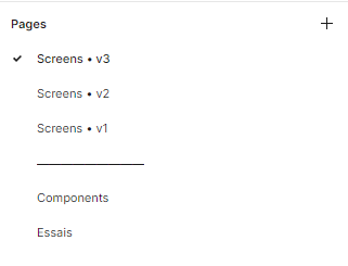
Pages structure

Page 1: Application Screens
This page acts as the central hub for all screens within the application.
It should exclusively contain instances of screens, providing developers with a direct and uncluttered view of the user interface elements.
Page 2: Project Components
This page organizes all reusable components utilized specifically within this project.
We use a design system so most of the components come from another Figma file, but accommodate project-specific variations land on this page.
Page 3: Design Archive
The third page is to maintain an archive of past iterations, screens, features, and components. This archive serves as a valuable resource for revisiting past ideas, salvaging useful design elements, and understanding the design evolution.
Version Control
As projects evolve, it’s inevitable to revisit and redesign certain aspects.
I create copies of screens with incremental version numbers (e.g., Screen_v1, Screen_v2) to illustrate design iterations.
This practice aids developers, especially those without access to Figma’s paid Dev Mode functionality.
Using thumbnails
Managing a large number of Figma files can become overwhelming. Thumbnails offer a powerful solution to quickly grasp key information about each project at a glance.
Inspired by a brilliant approach I encountered (though the source escapes me!), I implemented a customized thumbnail system.
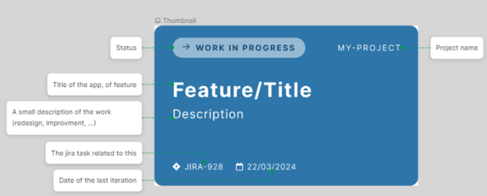
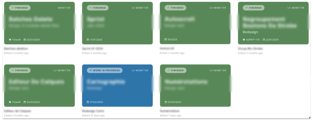
This system utilizes a component with multiple variants, allowing me to easily switch its state by changing the background color. Within the Figma file browser, this color-coding system provides a clear visual distinction between completed projects and those still under development.
Frames structure
Frame organization should prioritize user flow and screen transitions. Here’s the approach I use, inspired by Figma’s team in playground files.

The main application screen are positionned in the top-left corner.
I then sequentially arrange subsequent screens or variations on separate lines, depicting the user’s journey through the application. The leftmost item on a line is usually the landing page of a subpart of the application, and the frames on its right are its variation.
This structure fosters a clear understanding of the user interface flow and expedites the prototyping process by minimizing the need for excessive arrows.
Benefits of a Structured Approach
Having structuring principles in your Figma’s files, have many benefit and will help you along your UI journey.
It ensures smooth navigation for everyone involved, from designers and developers to clients. This clarity translates to projects that are easily maintained as they grow and change.
A well-organized Figma file streamlines prototyping and user testing, boosting efficiency.
Structured files also foster effective collaboration by providing a clear and shared understanding of the design process.
How do you structure your Figma files? I’d love to hear your approach and any efficiency tips you might have! Feel free to connect with me on LinkedIn to discuss further.
