If you ever worked in designing a software without a well-defined color palette, you know how frustrating, and challenging it can be. The constant struggle to find the right shade, only to realize it doesn’t work across all components, can drain precious time and impact collaboration with your colleagues.
Creating a good color palette in advance is an essential step.
What defines a good UI color palette in UI?
While personal preferences play a role, a successful color palette adheres to several key criteria:
- Brand Alignment: Your palette should evoke your brand identity. Consistency across your application reinforces recognition and trust.
- Avoid Overwhelm: Steer clear of overly complex palettes. Remember, Christmas trees are for the holiday season, not UI design!
- Choice Management: Too many options can lead to decision fatigue. Minimize the number of colors to keep things manageable.
- Accessibility Matters: Ensure your palette meets accessibility standards. Colors should be distinguishable by all users, including those with visual impairments.
But it’s all depending on your project really and some people will find it essential to include color meaning or be useable for dark theme for instance.
Choosing the right colors?
You can break a color palette down to three categories : primary colors, neutrals, and accents.
Primary colors
These are the foundation of your UI. They define your brand and set the overall tone. It convey a feeling : for instance you think of facebook as blue, and ikea as yellow right?
Most interfaces have one, sometimes they have two or three.
You will need 8-10 colors to tint your interface for these colors.

Grays
Almost everything in an interface is grey, check around. Texts, backgrounds, fields, forms, panels… they all rely on these subtle shades.
You will need 8-10 shades of grey to choose from. That’s a good balance between limiting your choices to avoid wasting time and having enough shades for your needs.
Accent colors
Also called semantic colors, you’ll need them for communicating different things to the user.
The most commons are the one used to emphasize different semantic states. Red is usually called for important problems or destructive actions, yellow for warnings and green convey a positive trend.
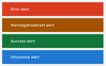
Another one that I like is an eye-grabbing color to highlight things in your interface, like a new features or a feature enabled by the user but altering the application behaviour (paused real time charts, filters hiding potential alarms, …). It’s more like a warning but in a positive kind of feeling, if that makes sense.
You’ll want multiple shades for these colors too, even though they should be used pretty sparingly throughout the UI.
Addressing other needs : specialized color palettes
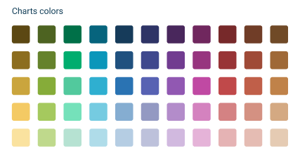
When we introduced graphs in our apps we were quickly stuck with the colors described above. For very simple graphs you can use your primary palettes (using shades are often better for accessibility purposes), but when your graphs may relate to different kind of measures, each one represented by a different color, your choices will soon be limited.
I opted for an exclusive palette for those cases, colors that fits well together, are not too close to each other and that we can differenciate easily between them. This kind of palette is useful when you need to categorise elements, so graphs works, but tags or events in a calendar also.
Remember that flexibility and adaptability are essential. Feel free to tailor your color choices based on the unique requirements of your project.
The creation process
Always begin with the primary color of your application. The other ones depend on it, because all your colors should work well together. And also because that one is probably mandatory in most cases (the main color of your brand for instance).
The process is mostly the same for every color you need. I’ll do an example with an ocean blue color for the example, but you’ll repeat the process for every color you need.
Let’s say we want 9 shades for our colors.

You will begin with the middle one.

That one should be the closest to your brand color, it will be used for primary buttons and all kind of “primary” part in the application.
A good tip it to use the color on a button background. It shouldn’t be too light or too dark, and the contrast needs to be easy with light or dark text.

Once you’re satisfied with your choice, you’ll want to find the edges.

The lightest will be used mostly to tint a component background, the darkest for text. So an alert component, which combine both, is a good choice to test them together. Start with the base color then adjust saturation and lightness until you’re satisfied.

Once this is done, you will need to fill the gaps. Start with the center value (3 and 7) and find the perfect compromise between the shades on either side of them.

Then fill again using the same approach.

And soon, you’ll have your first color palette. Congrats!

Other palettes
Neutral : Greys don’t necessarily have to be pure greys, and they usually aren’t. I like to include a bit of the primary color in them. It’s a good choice if you want colors to work in harmony. Working with HSL colors it’s easy enough just lowering the Saturation level, but be sure to change it enough so that it doesn’t feel like yet another color.

Secondary : If you need more than one primary color, the others are either taken from your brand color, or if you don’t have one specifically, you can use the color wheel to define one that works fine with your primary. In the latter scenario, select hues that lie directly across the color wheel for optimal harmony.
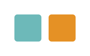
Accent colors : There’s no specific rule here. You’ll need to find green, yellow, and red colors that harmonize well together and with your color theme. They should be distinct enough to avoid confusion with your primary or secondary colors though. However, the building process remains consistent. 🙂
What I learned from this experience
As I reflect on my journey in creating palettes for various kind of needs, several key insights emerge:
- Not an Exact Science: While we can wield color theory and principles, there’s no universal formula that guarantees a harmonious palette. It’s a dance between aesthetics, psychology, and context. And sometimes, the perfect shade emerges unexpectedly.
- The Power of Proper Naming: A well-named color is important for future developers. When hues are thoughtfully labeled the development team gains clarity and effectiveness.
- Frameworks and Their Palette Demands: Some frameworks insist on a specific number of shades. If you’re aware of the technology used in the project beforehand, it can prevent unnecessary back-and-forth between teams.
In the end, crafting a UI color palette is part science, part artistry. While you may have specific colors to work with, the magic lies in crafting harmonious shades and subtly tweaking hues to enhance visual pleasantness.
