Recently at work, I embarked on the task of reorganizing the “settings” section of our application. Over the years, this area had become cluttered as new parameters were hastily added by the development team. We’ve all heard the saying, “We’ll improve that later,” haven’t we?
I had a preliminary concept for restructuring, but it’s always wise to challenge one’s ideas and involve users in the process. They bring fresh perspectives and concerns that may be invisible to us, given their unique interactions with the software.
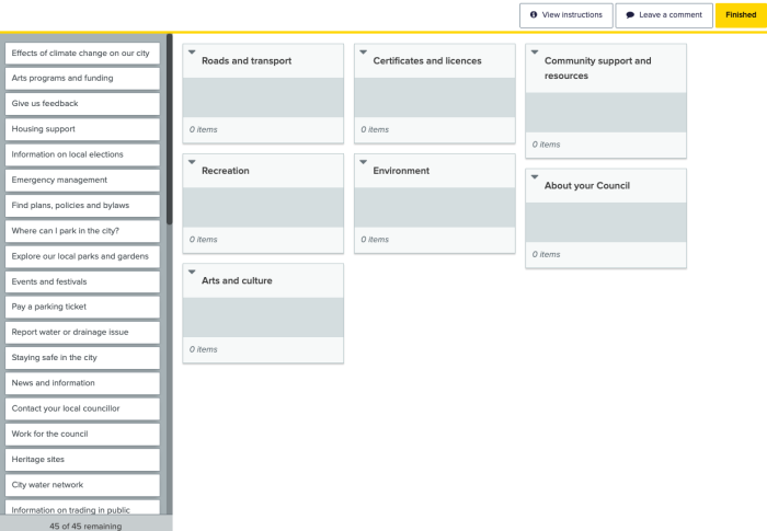
To gain insights into their viewpoints and organize the items effectively, we employed the card sorting technique.
What is Card Sorting?
Card sorting is a pivotal user experience (UX) research method in the design process, aiding in the intuitive organization and structuring of content. Participants sort a series of cards—each labeled with content or functionality—into groups that resonate with their logic. This technique sheds light on users’ mental models, illustrating their categorization of information and expectations from a product’s information architecture (IA).
Engaging users in content organization ensures that a website or application’s structure meets their expectations, simplifying the search for information. After all, isn’t that our ultimate goal?

Our Approach to Card Sorting
Without delving into exhaustive details of card sorting (for which there are excellent resources like [this page] or [this one]), we opted for open card sorting. In this approach, participants sort content-labeled cards into self-created categories, fostering idea generation and new IA definitions—precisely what we needed.
We began by cataloging all existing features of the software’s settings. It’s crucial to approach this task with simplicity to avoid preconceived groupings that might not align with others’ thinking. Surprisingly, people’s thought processes can differ significantly, and we wanted to honor that diversity. Hence, “add user” and “delete user” were treated as distinct features.
This was particularly relevant since we were revamping an existing “settings menu.” If one were starting from scratch, an idea generation workshop could be a stimulating alternative, often sparking brilliant new concepts.

Utilizing a free plan from Optimal Workshop, we were limited to 10 participants per card sorting study. I carefully selected the most suitable participants and extended invitations. The email outlined the card sorting process and requested confirmations to ensure full participation.
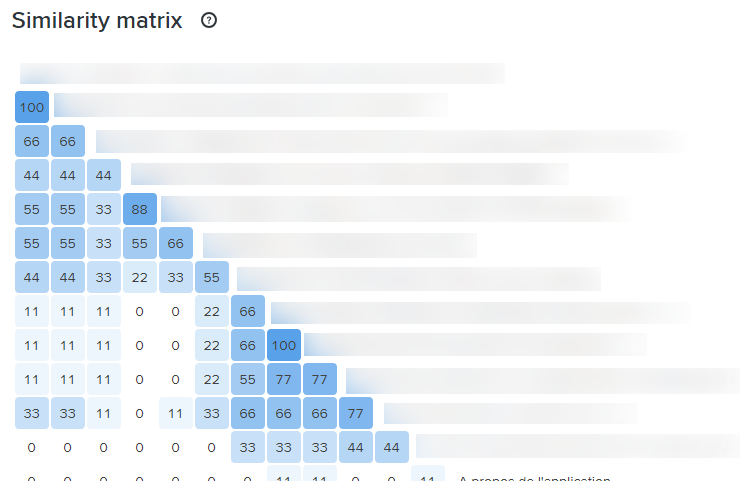
The choice of this online tool proved advantageous due to its user-friendly interface, no requirement for participant accounts, and comprehensive statistical output (including similarity matrices, dendrograms, PCA, etc.), facilitating multifaceted result analysis.

On average, participants completed the card sorting in 20 minutes.
The collected data provided a wealth of information, revealing patterns and commonalities in the participants’ grouping of the cards—a truly enlightening experience ❤️
What I learned from this experience
Advantages of Card Sorting
- Engagement: The card sorting exercise was not only insightful but also enjoyable for the users. They found it fun an interesting and were eager to participate.
- User-Centric Design: By placing users at the heart of the information architecture (IA) design process, card sorting ensures that the end result resonates with their needs and preferences.
- Insight into User Thinking: The method provided a window into the users’ thought processes, revealing how they perceive and categorize information, which is invaluable for aligning the IA with their mental models.
- Efficiency: Card sorting proved to be an efficient way to collect data from a diverse group of participants, offering a comprehensive perspective on user expectations.
Challenges of Card Sorting
- Subjectivity: While insightful, the results of card sorting can be subjective, often necessitating further research to validate the findings.
- Limited Scope: It focuses on categorization and may not address all aspects of IA.
- Participant Bias: The outcome can be swayed by the participants’ prior familiarity with the content, introducing a potential bias.
The Outcome
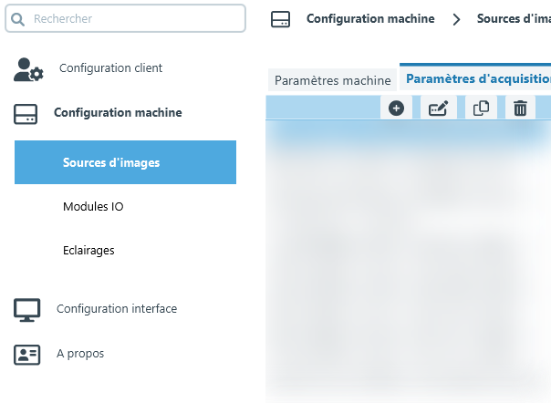
We transformed a once chaotic tab menu bar into a streamlined interface. The settings were reorganized into four distinct sections, each with its own subsections. This new structure was met with enthusiasm from our users, who now navigate the application with greater ease and independence. The result? Time savings for the users and reduced workload for the support team—a true win-win situation!
Before

After


